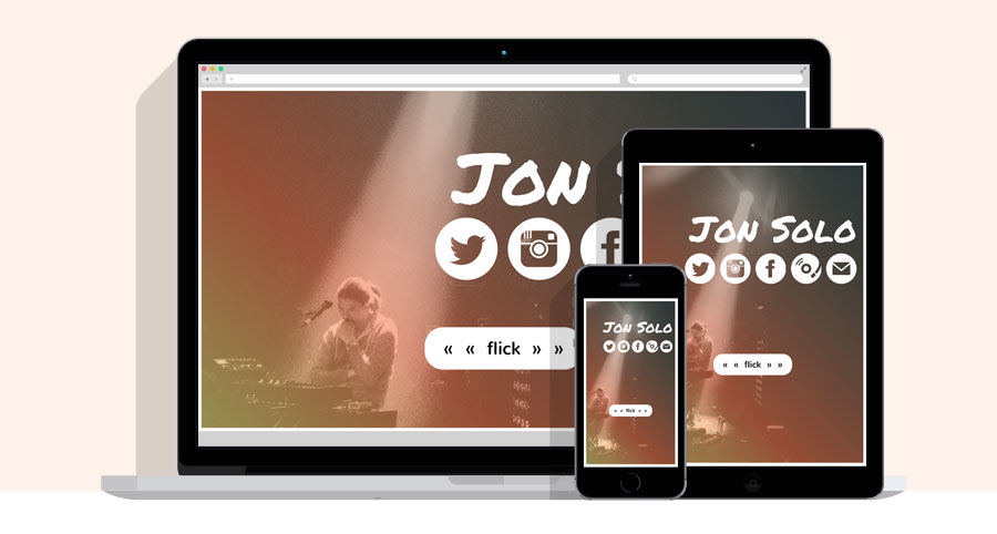
Jon Solo had a unique set of requirements when he approached me about relaunching his website. First, it needed to look great on an iPhone. As a touring musician, he often needs to show prospective collaborators his website immediately, on the device that is in his pocket. Second, it should be focused on his career as a side musician, yet still showcase his own songwriting.
The content strategy was to simplify as much as possible. Let videos of his performances speak to his abilities and accomplishments. Use audio to demonstrate his mastery of instruments. Link to the social media accounts where he is already connecting with his audience.
From a UX design standpoint, I took the mobile-first requirement and ran with it. One of the most frustrating experiences on mobile is navigating a website. From hamburger menus with hidden navigation to pinching and zooming, the user experience can quickly degrade. Realizing we had such simple, interactive content, I modeled the navigation on the basic iPhone "swipe" gesture users are already familiar with. Solo loved it! He said it made his website fun to show people!
Visit WebsiteAt EMC, I was on the UI team charged with developing the JavaScript application for configuring OneFS, the operating system that powers EMC Isilon’s data storage hardware devices. The highlight of my experience was moving the UI team away from printed design specs that quickly became out of date and unwieldy, to a more collaborative process built on rapid prototyping with interactive workflow mockups.
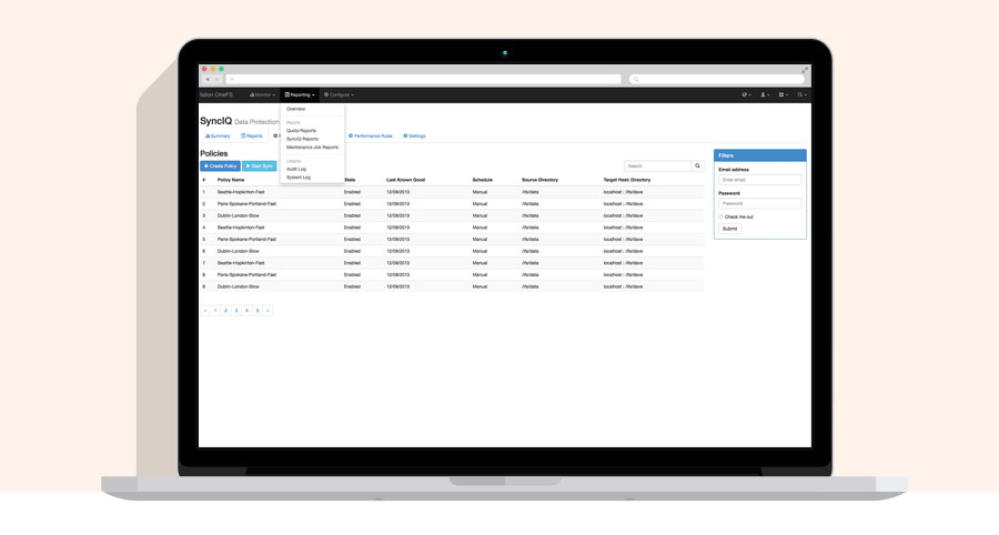
My role was fluid: UX/UI designer, front-end developer, and project manager. My mission was to interpret complex features into easy to use and understand user interfaces. I was responsible for all phases of a feature's lifecycle: research, design, implementation, testing, and release. The team followed an agile software development model utilizing two-week sprints and daily stand-ups. I worked with individuals and teams across the entire engineering organization. My communication skills, collaborative nature, and attention to detail proved vital to my success.
Examples available by request
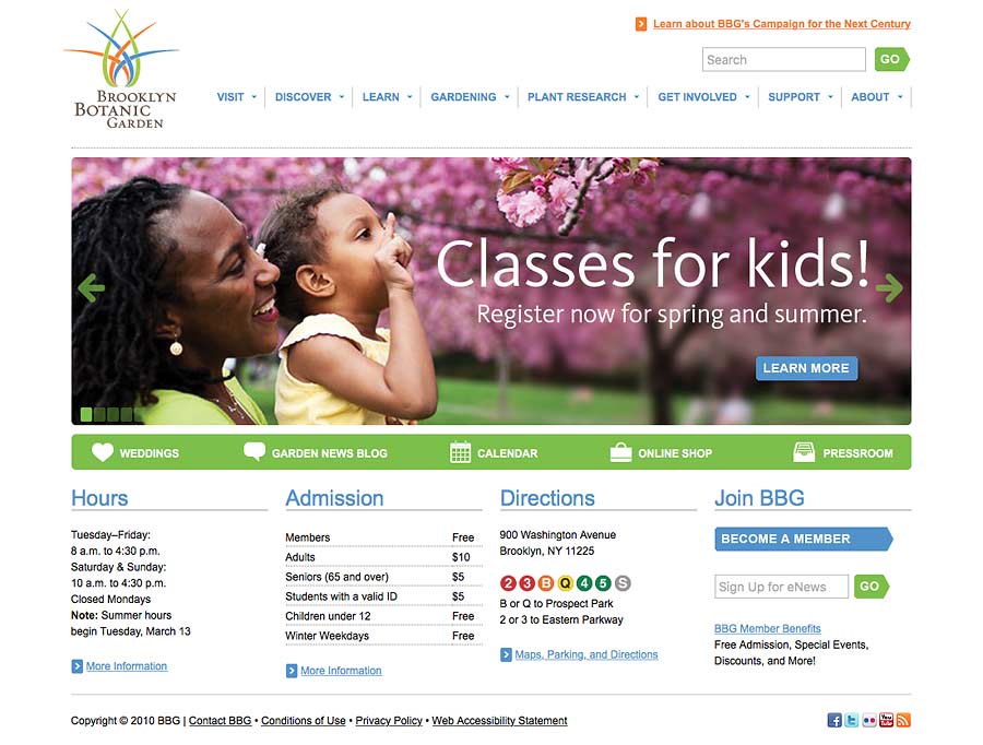
Working under the Director of Publications, I engineered a massive realignment of Brooklyn Botanic Garden's main external website touching all facets of web development. I migrated the site from static HTML to the ExpressionEngine content management system. I used the site's existing analytics to intelligently update the IA. I collaborated with the marketing department to craft a design that complimented the existing branding and visual identity. I coordinated with staff to launch a blog, a dynamic event calendar, and other new content.
One of my favorite parts of the realignment was adding frequent, beautiful photography to the site dynamically via the Flickr API. Current images of plants in bloom, events, and all the grounds were easily added to the site just by uploading to Flickr and adding the appropriate tags. I also created unique time-lapse videos of plants in bloom that garnered signficant attention online.
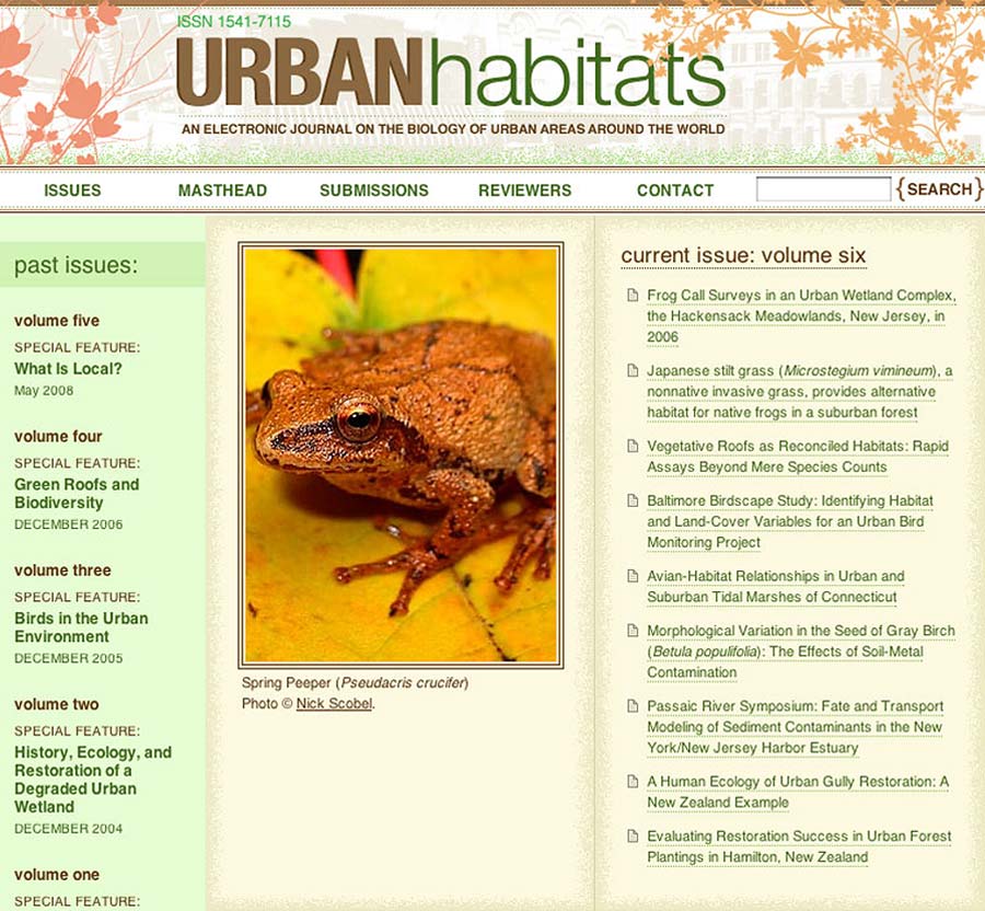
Visit Archived WebsiteDuring my stint as web production assistant, I redesigned the visual identity of Urban Habitats, an online scientific journal created by Brooklyn Botanic Garden.
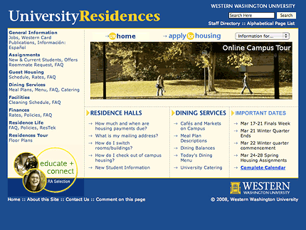
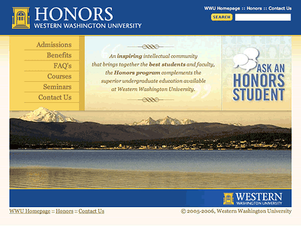
Visit Archived WebsiteWhile employed full-time in the Office of Admissions, I was frequently "loaned-out" to other offices related to the prospective student experience in order to update their online presence. I redesigned the University Residences and Honors program websites in this capacity. In addition, I served on a team that realigned the main university website including UX and IA design.
Screenshots available by request
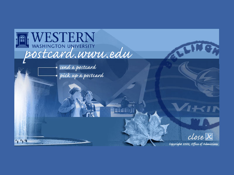
As a student at WWU, I worked as a web designer for the Office of Admissions. One highlight during that time was pairing with another student developer and building postcard.wwu.edu, a web application for sending virtual postcards with custom messages.
Offline